

the challengE
—
How might we improve the self-service kiosk experience for a Wawa customer?
kickoff
—
Identifying the opportunity
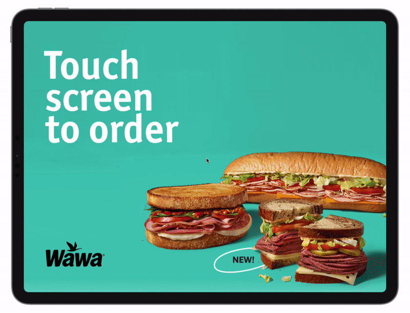
Wawa’s kiosk system has enabled Wawa to serve more customers, serve them faster, and consistently get their orders correct. The result is a great capability to elevate customer loyalty and ladder up to business goals offering customers new products and special promotions via up-sell and cross-sell tactics.
The high-level goals were to identify the following:
What issue(s) are we solving?
What type of people would benefit most from the kiosk?
What is the main benefit the users receive from the kiosk?
How can we enhance the benefits they can receive from the kiosk?
Research Approach
—
Early insights from the field
At the outset of the project, we didn’t have pre-existing insights. In order to generate a problem solving roadmap, we took a trip to Wawa to explore the kiosk functions, store environment and go through the process of ordering food through the kiosk. While in the store, we observed user behavior and conducted quick-hit interviews to get users’ immediate feedback after using the kiosk.
““I know if I’m placing the order and checking it, it’s going to be right.””
““Sometimes I’m really tired and I don’t want to talk to anyone. I’m happy to just place my order from the kiosk.””

DEEPER INSIGHTS
—
Food kiosk enthusiasts weigh in
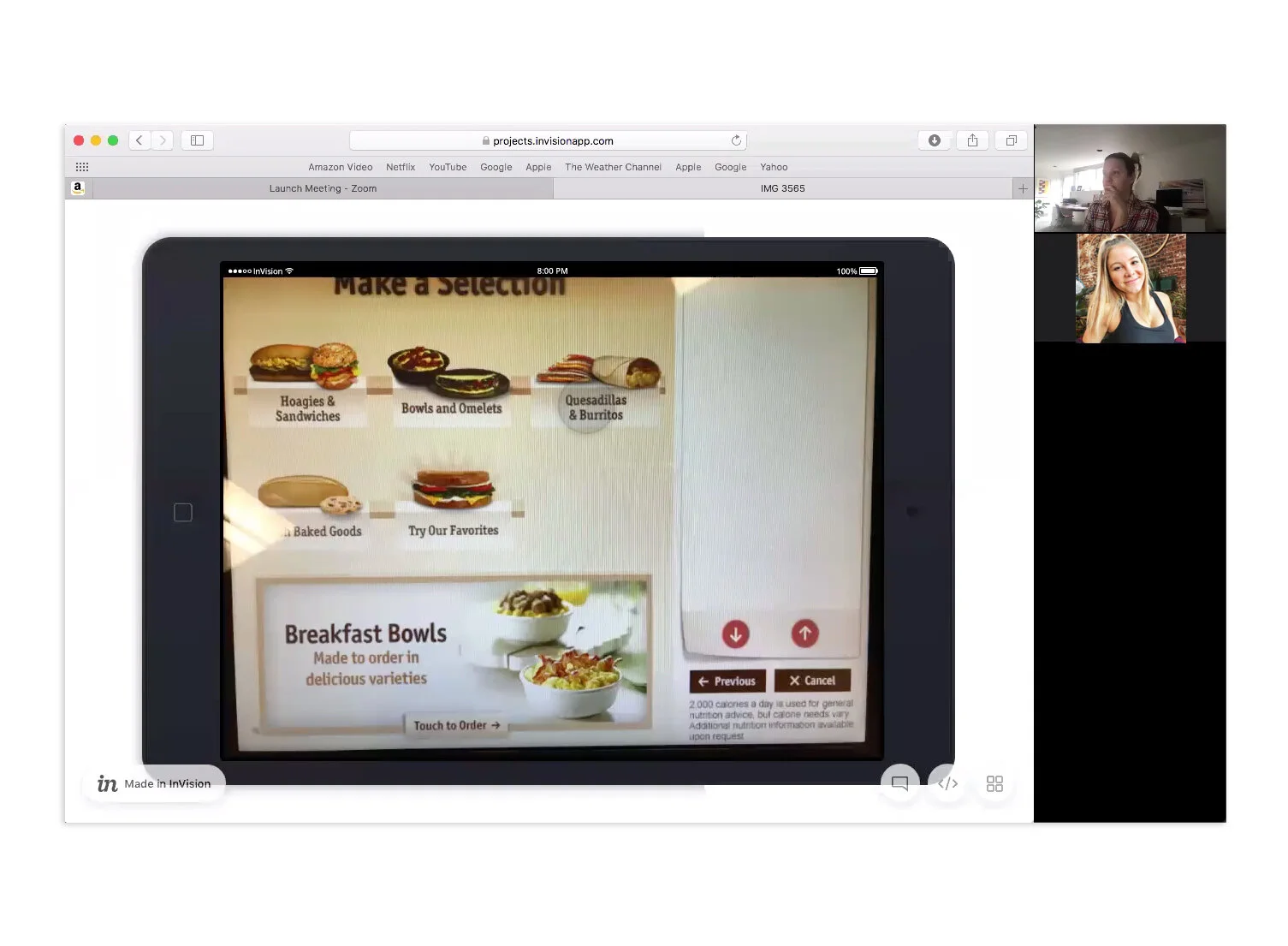
After identifying users who have experience with Wawa kiosks via screener surveys, we scheduled remote contextual interviews. An identical prototype of the existing kiosk was developed to allow us to make observations of how the participants used the kiosk and outline successes and pain points.
““Why do I have to de-customize a sandwich to customize my sandwich. This is annoying.””
“”I feel like this is confusing. I’m forced into artificial choices. I want to see all the options at once.””
Contextual Interviews
We observed the users performing tasks under 2 scenarios and received in-depth feedback through a series of questions. Below are a few quick video highlights of the feedback received.

REFRAMING THE PROBLEM
—
While users are generally happy with the kiosk experience, there are areas that are not serving them. We distilled the data into 2 key findings. Users have a shared need for a:
“1.
“Build your own” breakfast sandwich feature to solve for ease of use and efficiency”
“2.
Pay at kiosk feature to solve for longer wait times”
While some cross-sell/up-sell tactics to add bacon, a beverage or bag of chips to the order are acceptable, the upfront push to select a pre-customized breakfast sandwich is overcomplicating the interface. Users are left confused with having to customize a sandwich through eliminating ingredients from an existing sandwich. Additionally, the inability to pay at the kiosk for customers who don’t plan to purchase other items, leads to additive steps in the customer journey.

Additional key motivational insights that defined the direction for the experience:
—

Inclusive Design
Selecting pictures for users with learning disabilities makes it easier for them to order more efficiently. Accessibility features actually motivates them to go to Wawa.

Order Transparency
Having clear visibility of all the ingredients selected and price per item makes users feel more confident before they commit.
the Kiosk redesign
—
Designing an improved experience
The existing food ordering kiosk was poorly designed for users looking to build a customized breakfast sandwich. The goal was to create an updated design solution that eliminates error-prone conditions and keeps users informed about where they are in the process.

Initial sketches developed on paper to map out the design concept before bringing medium and high-fidelity prototypes to life.

Wireframes developed to map out defined tasks and scenarios aligned with user goals before fleshing out high-fidelity prototype.
detailed design
—
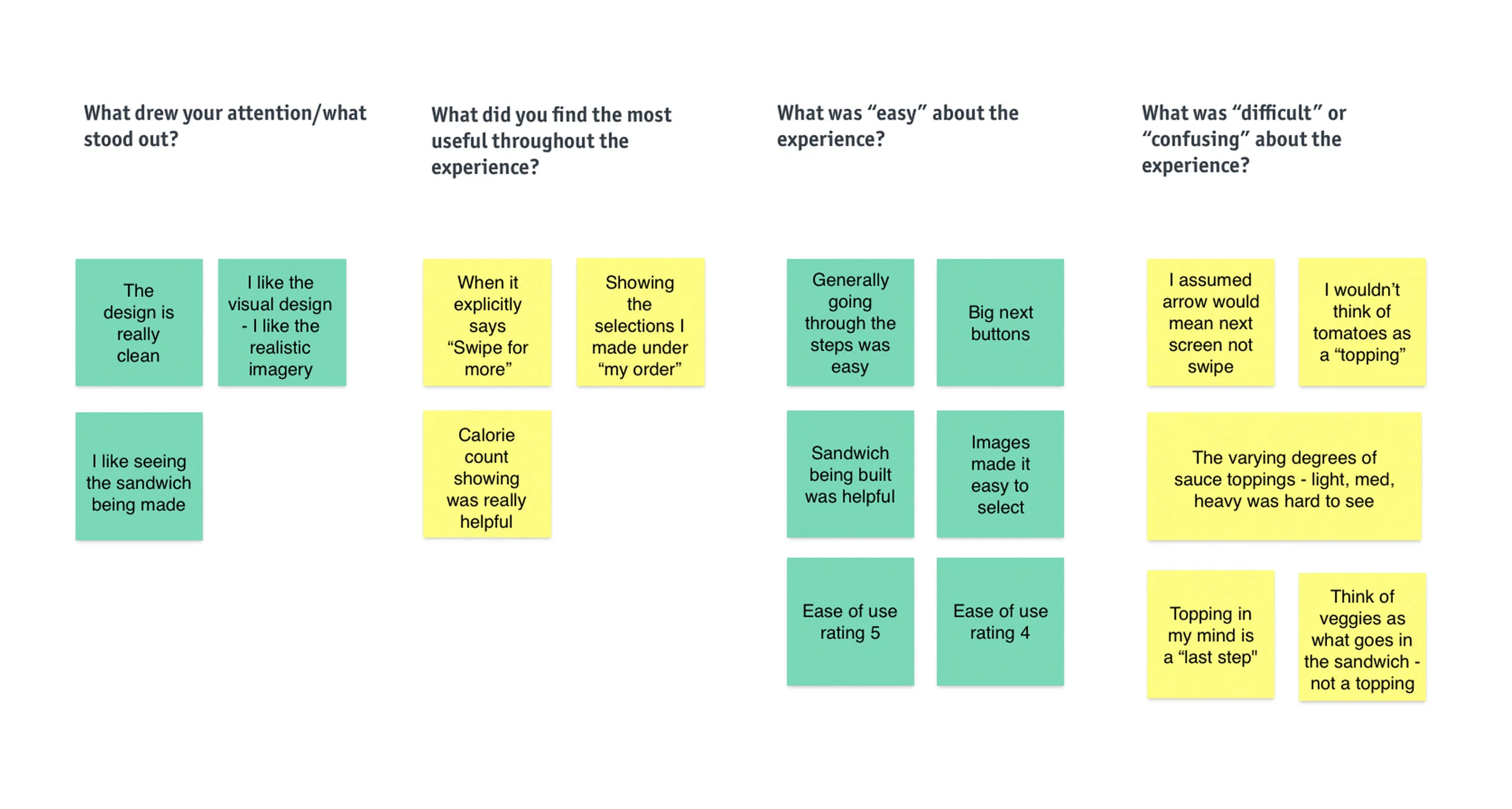
Usability Testing and Takeaways
Design iterations explored ways to show process steps, refresh the visual design with a cleaner look and feel (see ya later skeuomorphic elements!) and chunk information in a digestible format.
Prototyping was an effective way to gain meaningful feedback from users. We conducted usability testing, which successfully highlighted key issues to resolve. The themes that surfaced influenced key improvements to streamline the modules, add more explicit affordances and rethink the structure of “Toppings” and “Sauces”.

the refinement
—
Build your own breakfast sandwich - brought to life.
The prototype below showcases the refined visual hierarchy and interactions of the kiosk. One final test was conducted to validate the design. Overall, positive feedback was received on the reimagined features and updated design.